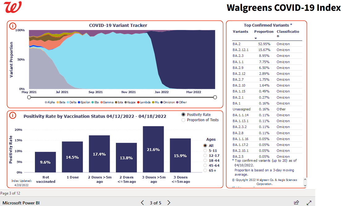
285 Bad news for the death jab pushers! Walgreens is reporting covid positivity rate by vaccine status. Link to source in the comments. (media.greatawakening.win) posted 2 years ago by MarleyGoat 2 years ago by MarleyGoat +285 / -0 75 comments download share 75 comments share download save hide report block hide replies
Source for report: https://www.walgreens.com/businesssolutions/covid-19-index.jsp
11.8% positivity rate increasing to 16.4% is a 38% increase in positive tests (4.5/11.8).
I think the other graph is more telling, the proportion of tests. 26.8% of the total tests, only 16.7% of the total positives.
Thank you for the source! I wonder how long they will leave it up...