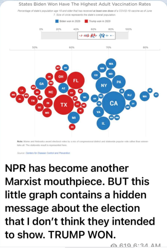
Unfortunately, it takes a bit of thinking to understand what the graph means. It is quite amazing how it shows that obviously the four blue states on the Trump side actually were Trump states.
One thing I don't get about the graphic is why there is a split in the two halves. Shouldn't it be a continuous distribution?
So PA doesn't count because it doesn't fit the data? Isn't that what we bitch about regarding covid? Look, trump won, we all know it but let's not reach. They aren't saying what the OP claims. That's all I'm saying. Peace.
Unfortunately, it takes a bit of thinking to understand what the graph means. It is quite amazing how it shows that obviously the four blue states on the Trump side actually were Trump states.
One thing I don't get about the graphic is why there is a split in the two halves. Shouldn't it be a continuous distribution?
No the color is who won the state. The location (left to right) is the % of people who got jabbed, see just above the circles for percentages.
This graph doesn't show trump won the election. It shows trump and Biden states and how they voted affects the % of jabbed people.
I think the point is the four blue states on Trump’s side are the four swing states that cheated in the election. With the exception of Pennsylvania.
So PA doesn't count because it doesn't fit the data? Isn't that what we bitch about regarding covid? Look, trump won, we all know it but let's not reach. They aren't saying what the OP claims. That's all I'm saying. Peace.