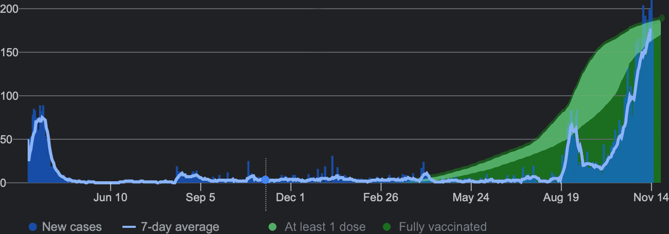
447 Quick graph - New Zealand vaccinations (green) and covid cases (blue) (media.greatawakening.win) posted 4 years ago by arathyra 4 years ago by arathyra +447 / -0 91 comments download share 91 comments share download save hide report block hide replies
Great point. I just synced the timeline together; they would have different scales. As I wasn't so concerned with the X as the Y axis. As I mentioned above, this is actually Google's presentation of JHU data, which makes it all the more damning imo.