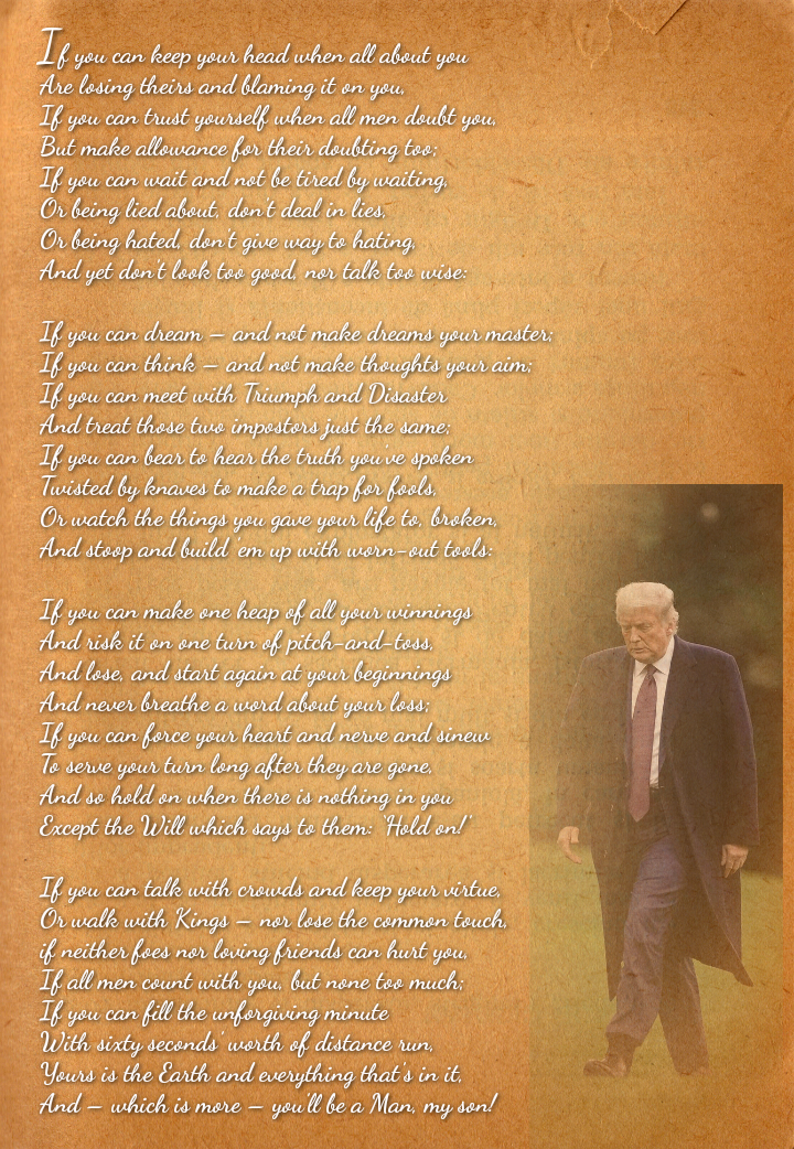
The poster is legible, the discussion was about how to make it more impact full, and I was suggesting a cursive font that was simpler to look at in a full page.
It's the connections that are essential to all cursive styles. Other languages based on different characters don't have loops, for instance Chinese or ancient Egyptian (called demotic script). Those languages look like paint drips, not like letters at all. English letters have round parts and they can be exaggerated to loops. There are many styles of cursive and they are all "correct" if you can read them, the differences are a matter of fashion. Look up an old English cursive STYLE called Spencerian: this was the style that was standard in the 19th century. It was much fancier than the common styles taught since the early 20th century. In the older writing it was considered very artistic to make "flourishes" which are very loopy, out of the low parts like the lower part of "p," and out of capital letters like S or G that have big round parts, and "swashes" which are extra long cross marks, like the top of capital T and F. Nowadays this is a special art called calligraphy. People don't even learn regular cursive in many schools. Good for you that you know cursive at all. Perhaps if I had said "knots" instead of "loops" it would have been more clear what I meant. Look at the page as a whole, a little out of focus, so you see the words as blocks. Some of the letters have a tight little circle at the top, much smaller and tighter than handwriting. If you start noticing that detail it becomes distracting. My suggestion was to find a style that was simpler, so the details of the letters would not distract from quick reading.
You must be able to read cursive to be able to read original documents from the past. BTW, perhaps your computer monitor is not good, as the poster is sharp on my computer. I don't see anything in the writing that's different from how I write and how I was taught in school, except some of the capital letters are more like printed letters. I don't see any "detail" that's distracting. I don't see any "knots" at all. I see the "loops," and those are exactly like I write.
I looked at a sample of Spencerian, and it's not too different from what I was taught in school, except the caption and capital letters were a little fancier. Also, the writing was more precise and uniform than I and my classmates could manage. My handwriting is a little less uniform now, as most of my handwriting only has to be readable long enough for me to copy type it into my computer. I write notes longhand, as I can do that anywhere I happen to be. "The Art of Manliness" says that every man should have a pad of paper and a pen or pencil in his pocket at all times. I've done that my entire adult life.
You should be careful about assuming what other people think, this is what leads to people feeling offended if you assume the wrong thing. Once again you assume incorrectly. I worked hard to improve my own writing and I am dismayed that cursive isn't taught, exactly because this is necessary to read documents from the past. And my monitor is fine and so is my vision. I'm talking about artistic qualities and how people perceive a work of art, like this poster, as a whole.
The poster is legible, the discussion was about how to make it more impact full, and I was suggesting a cursive font that was simpler to look at in a full page.
It wouldn't be "cursive" then. It must have the loops and connections to be cursive, rather than printed letters.
It's the connections that are essential to all cursive styles. Other languages based on different characters don't have loops, for instance Chinese or ancient Egyptian (called demotic script). Those languages look like paint drips, not like letters at all. English letters have round parts and they can be exaggerated to loops. There are many styles of cursive and they are all "correct" if you can read them, the differences are a matter of fashion. Look up an old English cursive STYLE called Spencerian: this was the style that was standard in the 19th century. It was much fancier than the common styles taught since the early 20th century. In the older writing it was considered very artistic to make "flourishes" which are very loopy, out of the low parts like the lower part of "p," and out of capital letters like S or G that have big round parts, and "swashes" which are extra long cross marks, like the top of capital T and F. Nowadays this is a special art called calligraphy. People don't even learn regular cursive in many schools. Good for you that you know cursive at all. Perhaps if I had said "knots" instead of "loops" it would have been more clear what I meant. Look at the page as a whole, a little out of focus, so you see the words as blocks. Some of the letters have a tight little circle at the top, much smaller and tighter than handwriting. If you start noticing that detail it becomes distracting. My suggestion was to find a style that was simpler, so the details of the letters would not distract from quick reading.
You must be able to read cursive to be able to read original documents from the past. BTW, perhaps your computer monitor is not good, as the poster is sharp on my computer. I don't see anything in the writing that's different from how I write and how I was taught in school, except some of the capital letters are more like printed letters. I don't see any "detail" that's distracting. I don't see any "knots" at all. I see the "loops," and those are exactly like I write.
I looked at a sample of Spencerian, and it's not too different from what I was taught in school, except the caption and capital letters were a little fancier. Also, the writing was more precise and uniform than I and my classmates could manage. My handwriting is a little less uniform now, as most of my handwriting only has to be readable long enough for me to copy type it into my computer. I write notes longhand, as I can do that anywhere I happen to be. "The Art of Manliness" says that every man should have a pad of paper and a pen or pencil in his pocket at all times. I've done that my entire adult life.
https://upload.wikimedia.org/wikipedia/commons/f/f5/Spencerian_example.jpg
I think you just have a "thing" against longhand writing.
You should be careful about assuming what other people think, this is what leads to people feeling offended if you assume the wrong thing. Once again you assume incorrectly. I worked hard to improve my own writing and I am dismayed that cursive isn't taught, exactly because this is necessary to read documents from the past. And my monitor is fine and so is my vision. I'm talking about artistic qualities and how people perceive a work of art, like this poster, as a whole.