273 Blink and you'll miss it. (media.greatawakening.win) posted 5 years ago by CrimsonSentinal 5 years ago by CrimsonSentinal +273 / -0 42 comments download share 42 comments share download save hide report block hide replies

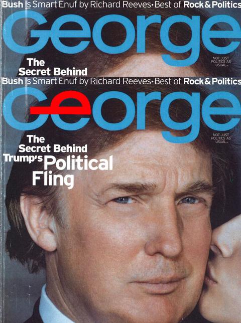
The spacing between the G & the E is different than between E & the O — the font makes all three letters circular.
But it looks a bit photoshopped. There was a post last night of this cover. Anyone have it?
It's an optical illusion. The cover of this magazine that is floating around the internet was shot with a camera and not scanned by a flatbed scanner so we aren't seeing a "true" straight on image.