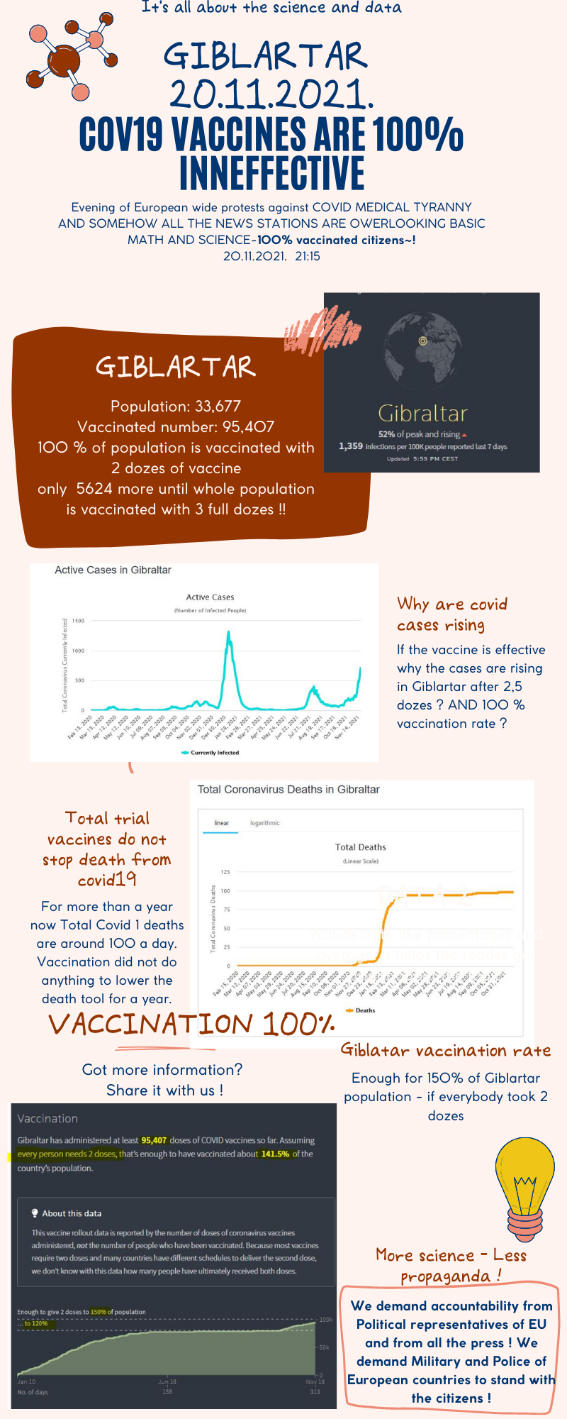
INFOGRAPHIC FOR NORMIE FRIENDS: Why Giblartar is a proof that VACCINESS ARE 100 % Ineffective -- 150 % Vaccinated population - they are 5.000 people shy from all of the population being triple vaccinated ~!
(media.greatawakening.win)
🤢 These people are sick! 🤮

I realize that you put a lot of effort into this, but I'm sorry, but this infographic is seriously misleading.
It is NOT 100 DEATHS PER DAY! It is 100 DEATHS TOTAL.
And you can see that most of the deaths happened in January, probably before people were vaxxed. Yes, there is a surge in cases recently, despite the high vaccination rate, but most of the deaths happened at the beginning of the year, probably before most people were vaccinated. In fact, the infographic seems to show that the initial vaccinates DID bring the number of cases DOWN.
However, it does show that the effect wears off; but that is a much weaker argument.
I understood the graph like 100 deaths per day or week? Can you elabrate and explain what should be writen there? also check for yourself
link
I found it on this site, you were right, daily deaths and the graph showed total deaths! Need to fix that promptly
I used this Reuters website