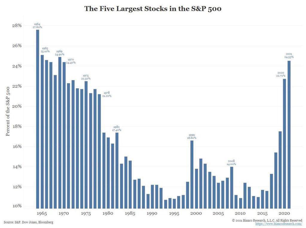
So, there are two takeaways from this chart. (1) it doesn't matter "which" 5 are far overweight the index. It simply matters this is unsustainable in a healthy economy that isn't manipulated. (2) the chart also shows a brisk rise in the valuation of only a few stonks vs the index. This rapid favoritism is ominous for the market and holders of those individual names.
So, there are two takeaways from this chart. (1) it doesn't matter "which" 5 are far overweight the index. It simply matters this is unsustainable in a healthy economy that isn't manipulated. (2) the chart also shows a brisk rise in the valuation of only a few stonks vs the index. This rapid favoritism is ominous for the market and holders of those individual names.
GLTA
I would still like to know out of curiosity regardless of whether it matters because I would like a source in general.