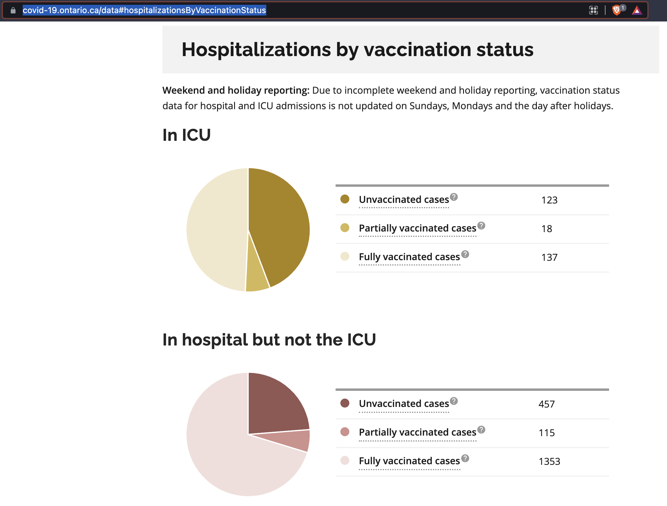
This image right here is one the main issues with this "pandemic".
Notice there are only 3 points of data in each pie chart; "Unvaxxed/Vaxxed/1 dose". This doesn't break down any variables such as:
Terminal patients
Nursing home residents
Severely chronically ill
Repeat ICU
Repeat Hosp
ICU/Hosp with "covid" or due covid (Broken arm tests positive. Is hospitalized for broken arm but is now considered covid case)
I checked the site in the URL and it claims anyone with a shot < 14 days = "unvaccinated". So they could get a jab, get sick and die on the 13th day and they'd end up "unvaccinated".
Also, they'll just point that that if you break the population of unjabbed/jabbed down, these charts actually show that unvaccinated are a threat.
They use per 1 million to give the probability of severe disease if you jabbed or not jabbed.
Summary: This type of data is for retarded normies.

This image right here is one the main issues with this "pandemic".
Terminal patients Nursing home residents Severely chronically ill Repeat ICU Repeat Hosp ICU/Hosp with "covid" or due covid (Broken arm tests positive. Is hospitalized for broken arm but is now considered covid case)
Also, they'll just point that that if you break the population of unjabbed/jabbed down, these charts actually show that unvaccinated are a threat.
They use per 1 million to give the probability of severe disease if you jabbed or not jabbed.
Summary: This type of data is for retarded normies.