from a graphing standpoint, you don't want to have a long description down there when a short one will work, it will make for a big left column. So it's possible, yes.
They could have made the full description vertical though. On the other hand, i've shown long term techs this technique and they were amazed it could do that, so you never know.
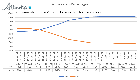
You'd figure if someone was smart enough to make that graph, they'd also be able to make the connection and sound the alarm:
STOP VACCINATING PEOPLE
Iceland The double-vaccinated are almost twice as likely to be infected as unvaccinated people, data from Iceland shows.
https://dailysceptic.org/2022/01/09/double-vaccinated-have-double-the-infection-rate-data-from-iceland-shows/
from a graphing standpoint, you don't want to have a long description down there when a short one will work, it will make for a big left column. So it's possible, yes.
They could have made the full description vertical though. On the other hand, i've shown long term techs this technique and they were amazed it could do that, so you never know.
yup
Would like to see the graph relating to deaths too.