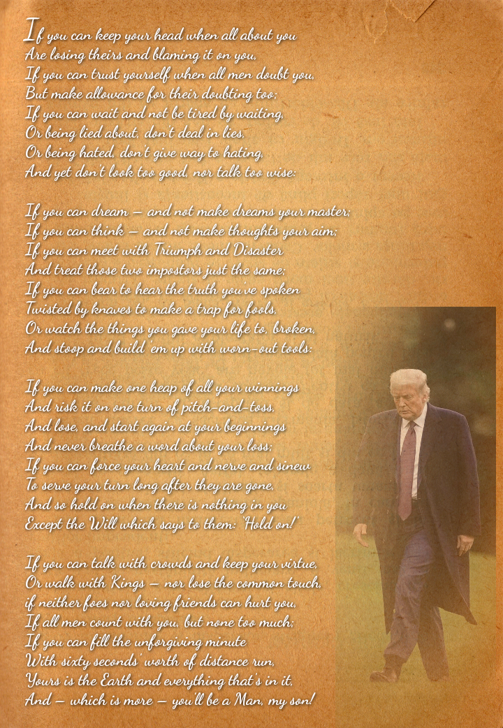
You must not have been taught cursive in school. The text is perfectly readable. If there are no "ties" or the "little loops," then it wouldn't be cursive. It would be printed.
That is not only a personally dismissive and insulting comment, but ignorant to boot. Of course I know that letters are connected in cursive and separated in block printing, since I have studied cursive and calligraphy in English, German, Russian, and Chinese. However, we are talking about the legibility of fonts on a poster. Go to any font site and see what they call a cursive font. The loops I mentioned are not essential to the cursive nature of this handwriting font.
The loops and connections are necessary for it to be cursive. It is meant to be written by hand quickly. I don't care what a "font site" calls it. The fonts on the poster were perfectly legible.
The loops actually were essential when I was in school learning to write in cursive in 3rd grade. And I still write in the manner I was taught.
The poster is legible, the discussion was about how to make it more impact full, and I was suggesting a cursive font that was simpler to look at in a full page.
It wouldn't be "cursive" then. It must have the loops and connections to be cursive, rather than printed letters.
No, I think you are correct. I very much enjoyed your answer, and agree, "you can't read cursive" is a little insulting.