155 Oh dear, let’s hope this isn’t true 🙏🙏 (media.greatawakening.win) posted 2 years ago by purkiss80 2 years ago by purkiss80 +156 / -1 24 comments download share 24 comments share download save hide report block hide replies

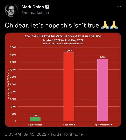
Agreed. We would expect the graph to look like this as most of the country is vaccinated. We need a graph that shows deaths per 100,000.