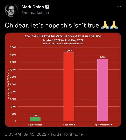
155 Oh dear, let’s hope this isn’t true 🙏🙏 (media.greatawakening.win) posted 2 years ago by purkiss80 2 years ago by purkiss80 +156 / -1 24 comments download share 24 comments share download save hide report block hide replies

Would rather see percentages. This doesn’t really mean anything without the total sample sizes as context.
Over what period of time also would be good to know. Also deaths should be per 100,000 people of each category.
This.
Those stats are also available and should be presented with this slide.
https://ourworldindata.org/covid-vaccinations
Says about 80% are vaxxed in UK, so the unvaxxed are ~20% but only make up ~3% of the covid deaths according to this chart...which means you're like 7 times more likely to die from covid if you got the shot.
Agreed. We would expect the graph to look like this as most of the country is vaccinated. We need a graph that shows deaths per 100,000.