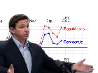
NUMBERS DON'T LIE: Recent study reveals that COVID-19 death toll is higher in Red states
Differences in death rates between anti-vax Republicans and masked-up Democrats will make the right-wing's "Great Replacement" theory a self-fulfilling prophecy.

It was a helluva time tracking down the actual study being discussed but I believe this is it:
https://arxiv.org/pdf/2209.10751v2.pdf
Someone smarter than me has to figure out there identification method. It sounds like rubbish to me.
Yeah on the surface level the results look very good for the deranged but I'm not losing any sleep over it. 99% certain there's something bunk with their methodology as this just doesn't bear out anywhere in reality.
Would love for someone to explain the ladle shaped graph on page 5. Shouldn't the graph on the left (pre-vaccine) be pretty much flat? Why is there such tremendous variation?
The label on the x axis is "Share of county population administrated at least one dose". So if there is a large variation on that factor pre-vaccine, doesn't that mean there is tremendous variation in the types of people present in these counties?
For instance, county populations are not evenly distributed--not even remotely. Take a look at Florida, with the largest county having 2.7 million and the smallest having under 8k. And in Ohio the swing is between 1.3 million and 13k.
https://worldpopulationreview.com/us-counties/states/fl
https://worldpopulationreview.com/us-counties/states/oh
Secondly, on this graph it actually diverges most in the less vaccinated counties. The blue county at 20% "vaccinated" had the highest "improvement" post-vaccination, not the one with 60%. The divergence is there, but it's concentrated at the wrong end of the graph to justify a benefit from vaccination.
If vaccination drove the divergence it should have emerged in proportion to it on the graph.
Basically, I'd really like to see the counties themselves on these graphs as I expect it'd kinda reveal what was actually measured by this study--likely tied to something like nursing homes or hospital policy or some extreme fluctuations in smaller counties that were "far right" but just happened to be loaded up w/nursing homes.
Great thought into this! I tried reading the study and their terminology was confusing. I could understand much of it, but it was written in a way to create confusion. Best way I can explain it is Yoda speech. You expect a certain arrangement to the words, but they come out in a different order. Some words seem to carry a different meaning. Is it possible that Kamala and her speech writers did this?
I'm gonna try and grab the nursing home data from floridahealthfinder.gov and see if it has the same red/blue pattern.
It'd make sense for a paper like this, that if there were a bad motivation they'd begin by looking at other data sets for a partisan bias they could use as a foundation.
Lies, damn lies and statistics.
The dems have certainly been occupied.
how many red states have sanctuary cities? Trying to kill off and replace votes?
Targeted biowarfare?
Probably more like targeted statistical shenanigans.
Agree.
Unfortunately, a lot of people on the right did not use the early treatment drugs. There was some unfortunate misinformation about there not being a virus, and others not taking it seriously. Also, the mRNA tech is sensitive to light and vibration, so the further it travels from the manufacturer, the safer it becomes. Some of the red areas are closer to the manufacturer. There could be targeted activity. Pfizer's contracts were unusually controlling about ensuring that their batches were going to where they wanted them to go.
Hahahahahahahahaha!!!